

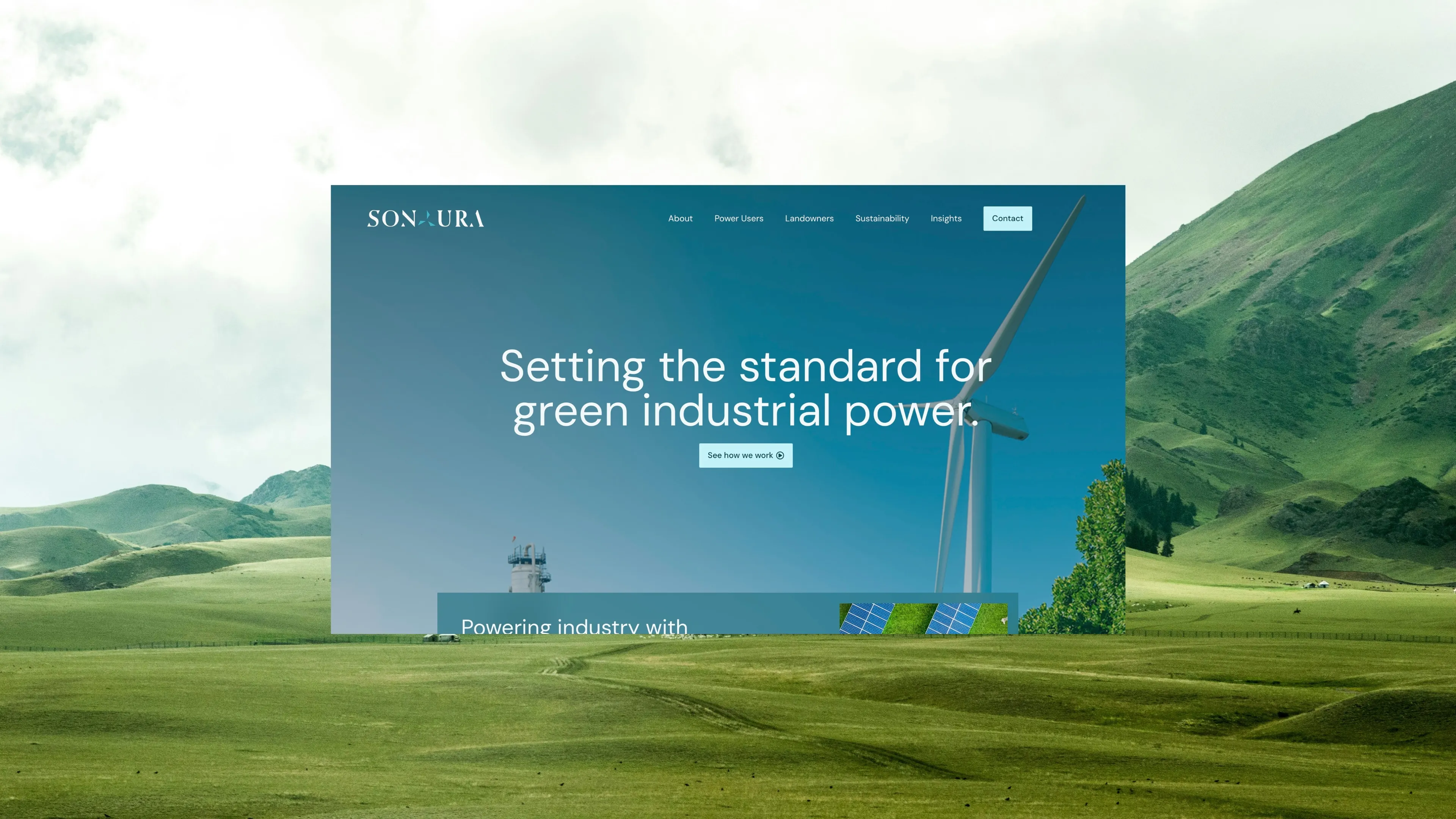
 Cover Image — 1920×1080 recommended
Sonaura Energy is a UK-based green industrial energy company with a clear mission: "Setting the standard for green industrial power." They serve two distinct audiences simultaneously — industrial businesses looking to reduce energy costs with independent solar power, and landowners interested in leasing their land for solar development.
The website needed to serve both audiences with authority while positioning Sonaura as the trusted partner for industrial-scale energy independence in the UK green energy transition.
Dual-audience mapping. Navigation and page structure designed for two distinct pathways: Power Users (industrial businesses) and Landowners — each with dedicated content flows and distinct conversion goals.
Industrial-meets-environmental visual identity. Dark, high-contrast design with green energy colour palette. Each audience segment has its own visual language while sharing the same brand system.
Custom theme build. Fast, optimised for Core Web Vitals. Separate inquiry form systems per audience segment — industrial and landowner inquiries routed independently.
Value proposition copy, sustainability messaging, and audience-specific content frameworks. Industrial case study structure and landowner partnership process documentation.
Industrial energy buyers are risk-averse and require deep technical credibility before engaging. Landowners have entirely different questions — income potential, land suitability, the partnership process. A single website architecture needed to serve both audiences cleanly without creating confusion between their respective journeys, while communicating Sonaura's green energy credentials in a market crowded with similar claims.
Audience bifurcation at the homepage level — clear pathways established in the hero section itself. Power Users move into technical capability, sustainability credentials, and case studies. Landowners navigate to income potential, land suitability, and the partnership process. The visual direction combines industrial authority with environmental optimism: dark photography, green accents, and clean typography that communicates both seriousness and sustainability.
 Homepage
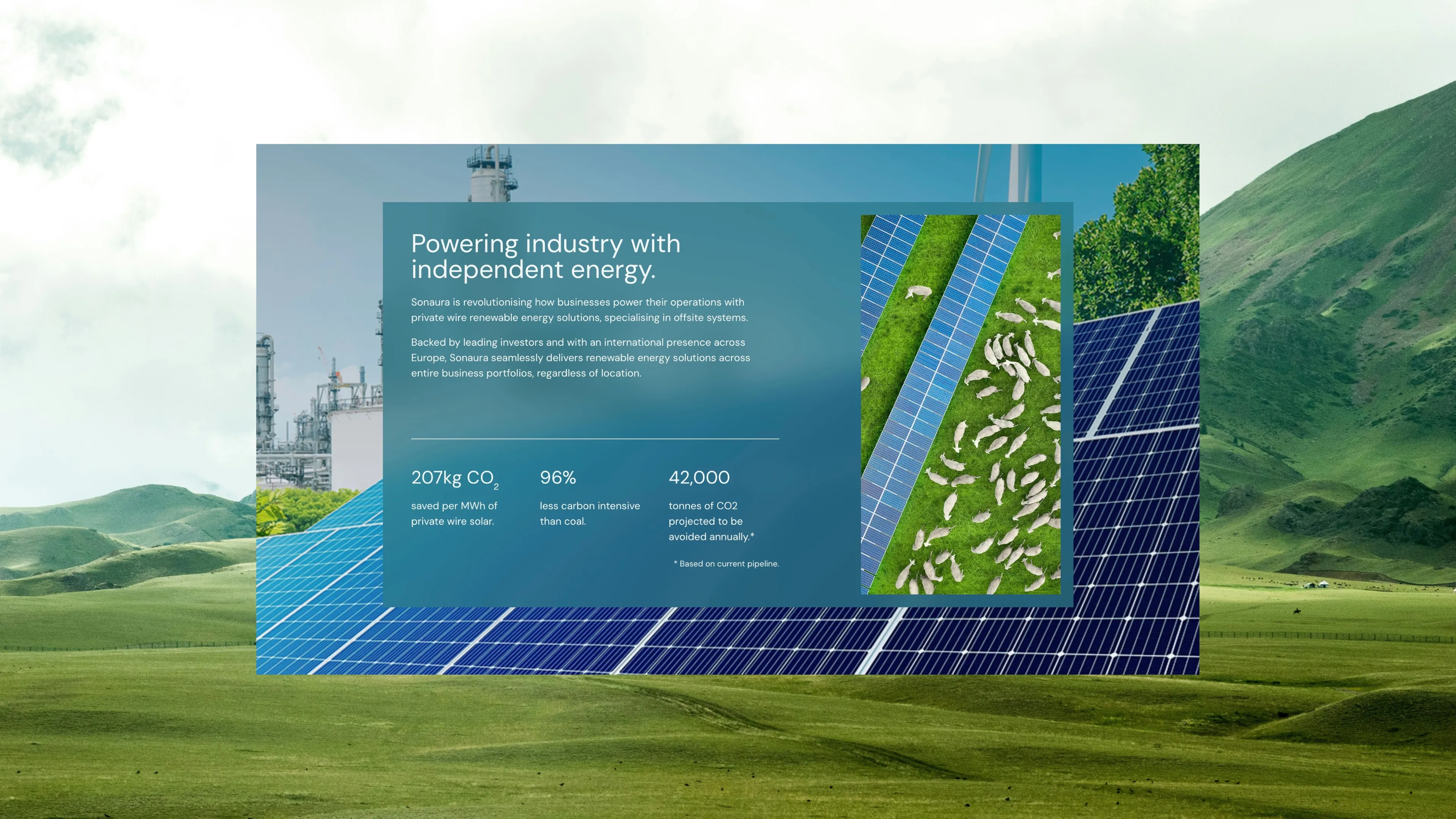
 Industry Solutions
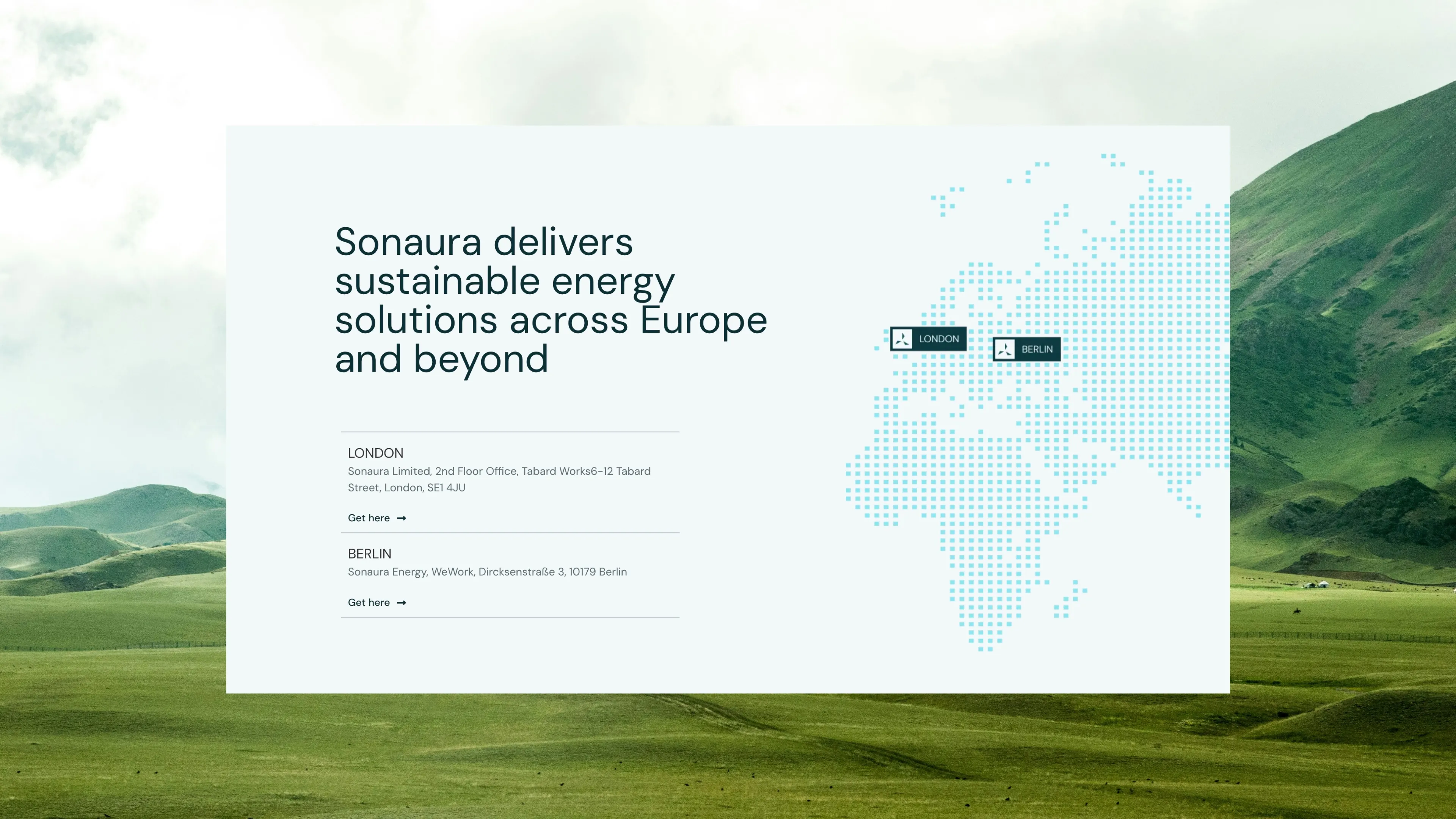
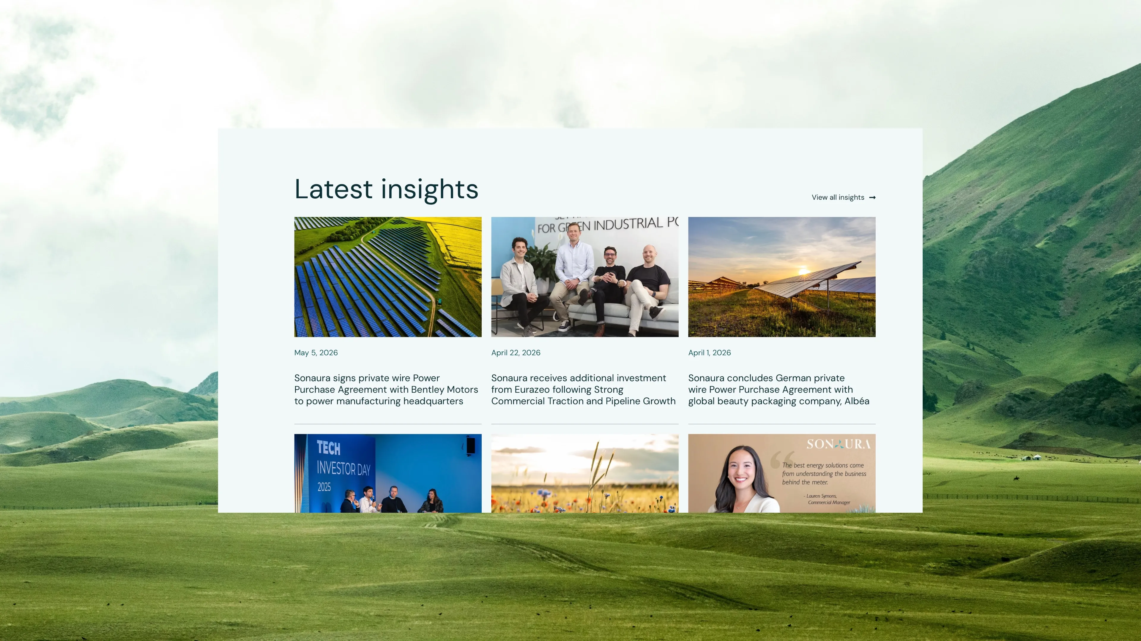 Locations & Insights
Industrial inquiry form submissions in first 90 days of launch
Landowner inquiry form submissions in first 90 days of launch
Average session duration on industrial buyer pages