


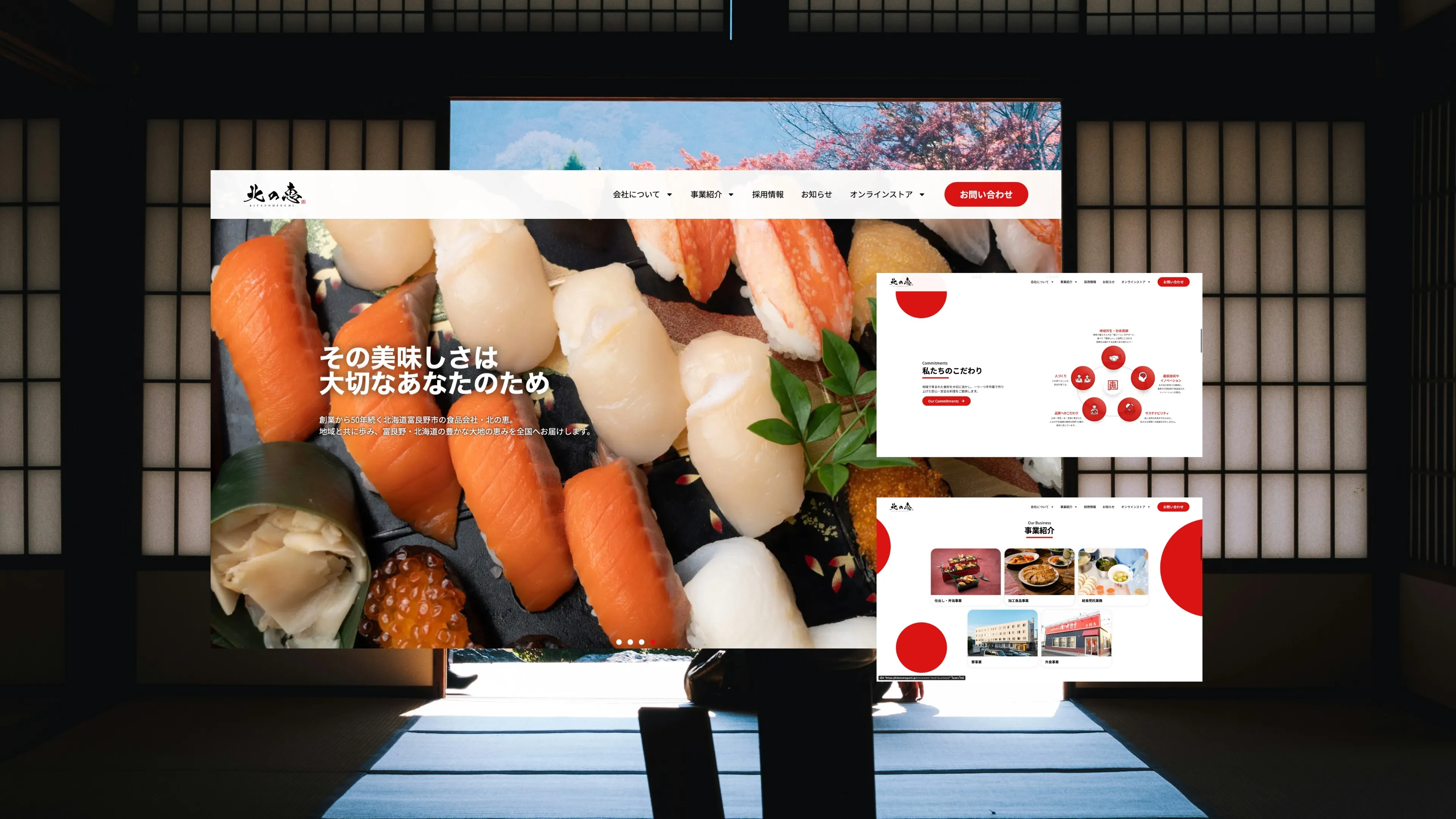
 Cover Image — 1920×1080 recommended
Kitano Megumi (北のめぐみ, "Blessings of the North") is a Japanese specialty food brand rooted in northern Japan's agricultural traditions, offering premium regional produce and food products.
Three separate digital properties serve different functions within the same brand ecosystem: the main brand site builds story and trust, the shop handles product sales, and the order system manages subscriptions and bulk orders. All three required full design, SEO, and professional photography direction.
Brand strategy & visual identity. Story-first layout with artisan editorial aesthetic. WordPress custom theme. SEO: brand + category keywords. Photography direction: hero imagery and product lifestyle photography.
WooCommerce store design & build. Product pages with flavour notes, origin stories, and food pairing. SEO: product and gift keywords. Photography direction: product flat lays and packaging photography.
Order system UX design. Subscription and bulk order flow architecture. Integration with main shop system. Performance optimisation.
Shared typography, colour palette, photography style guide, and UI component library — so each site feels like one brand world, not three separate projects.
Three sites. One brand voice. The complexity was maintaining visual and experiential consistency across three different functional platforms (brand, retail, order) while ensuring each served its specific purpose without confusing users between systems. Food product photography is also a critical sales driver in Japan — stock imagery or low-quality photography would immediately undermine the premium positioning of artisan, regional Japanese food.
A unified design system applied across all three properties — shared typography, colour palette, photography style guide, and UI component library — so each site feels like one brand world. Photography was directed with a consistent warm, natural, artisan Japanese aesthetic. SEO was built site-by-site, with the main brand site targeting brand and category awareness, the shop targeting product-specific and gift queries, and the order site targeting subscription and bulk keywords.
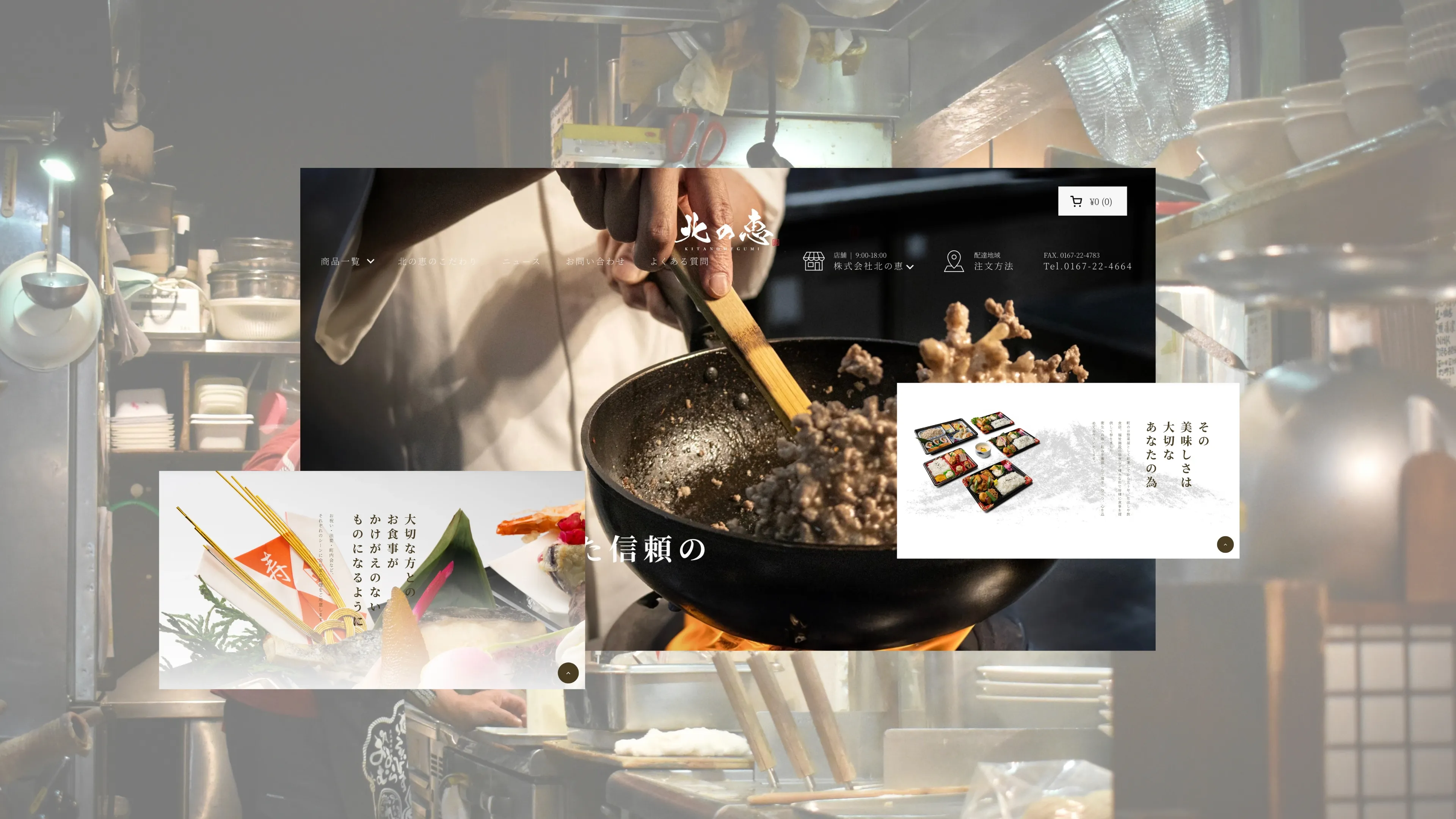 Online Store
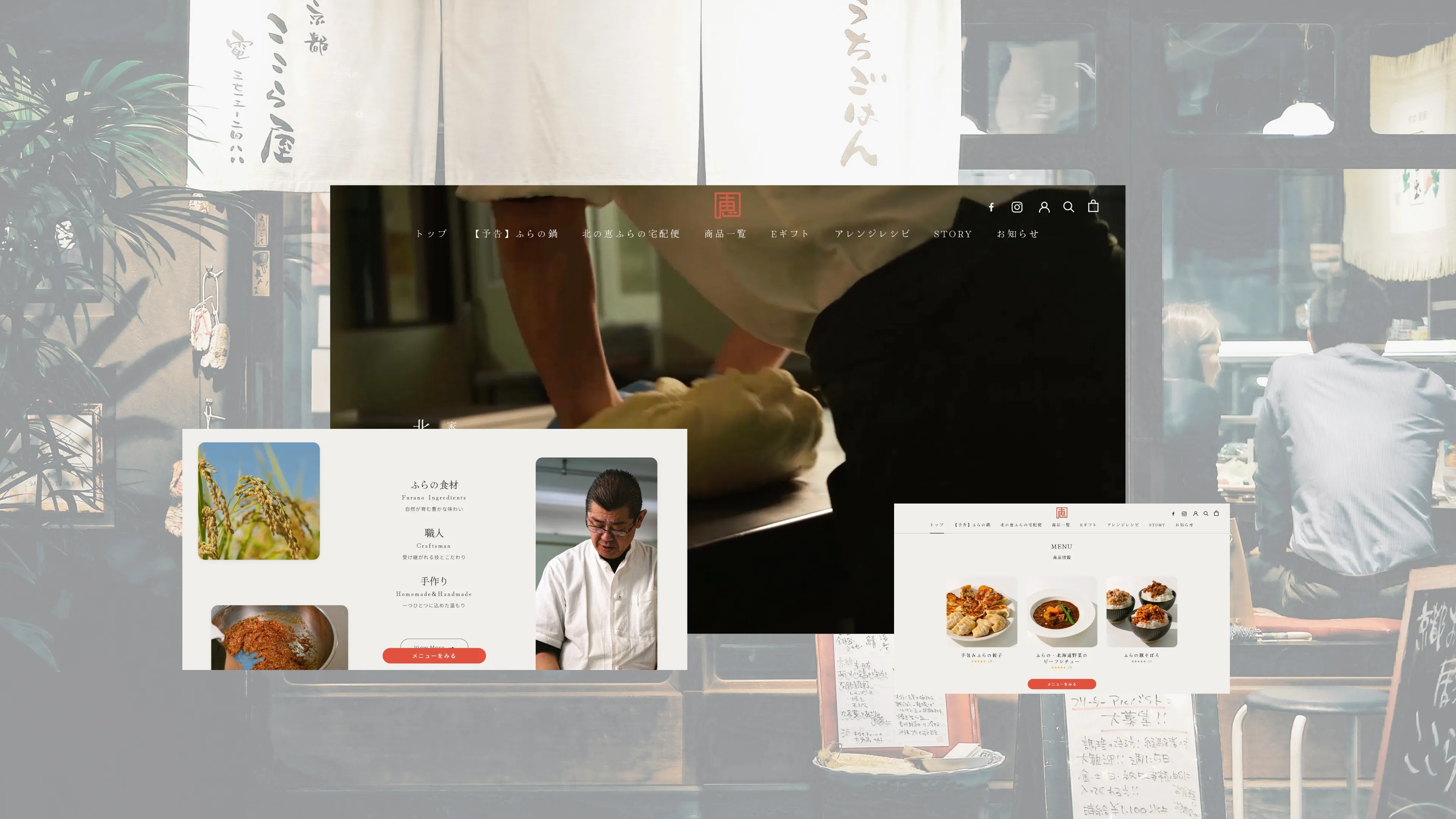 Restaurant Brand
Increase in average order value vs. previous system
Organic sessions/month across three-site ecosystem within 90 days
Subscription sign-ups in first month via order.kitanomegumi.jp