
This was a concept design deliverable — not a full development project. The design was created to demonstrate a stronger brand direction and presented to the client as a strategic recommendation.
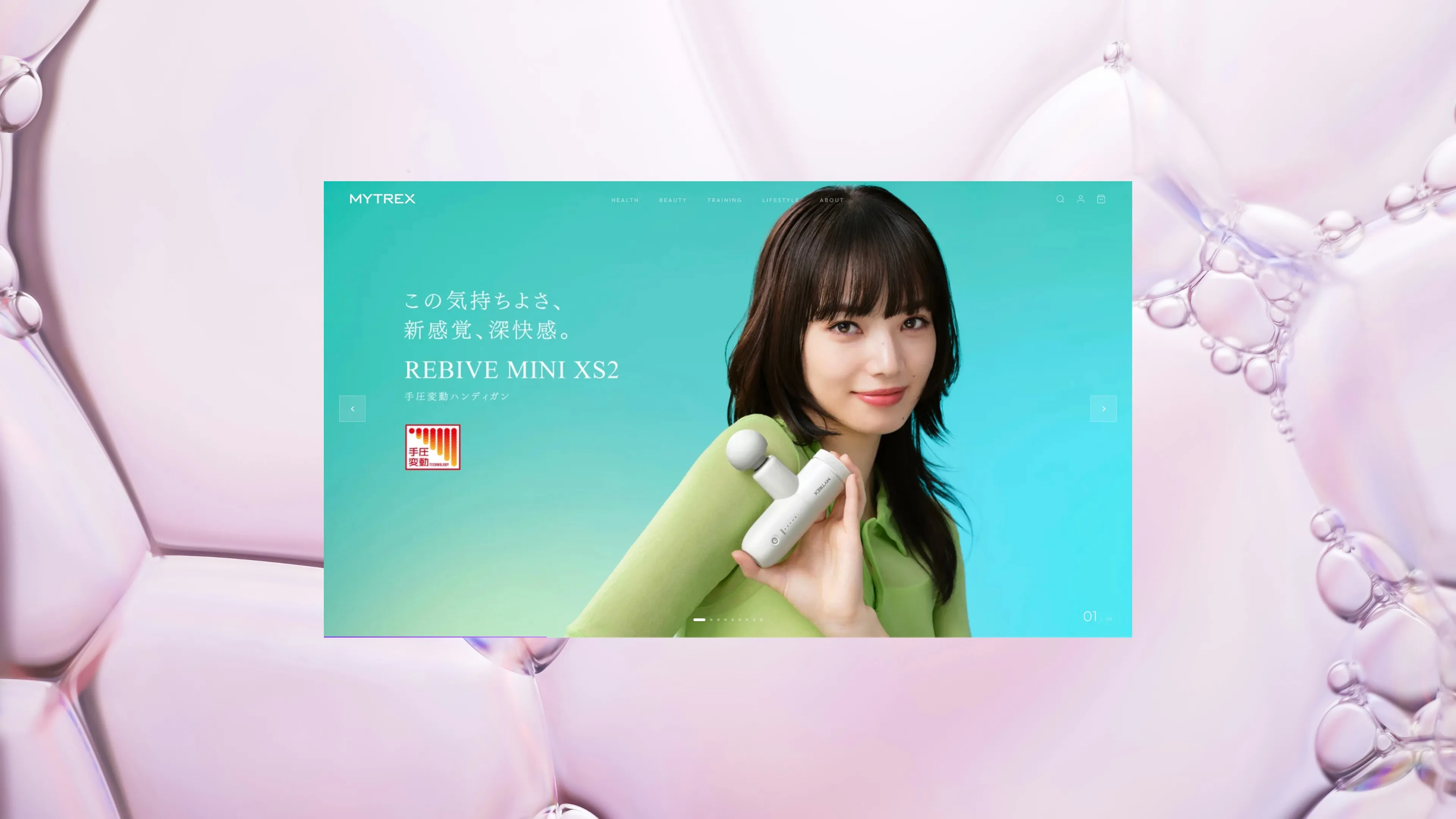 Cover Image — 1920×1080 recommended
MYTREX is a Japanese wellness and beauty technology brand founded in 2017 by Sotsu Medical Co., Ltd. — known for science-backed self-care devices including massage guns, EMS scalp tools, beauty tech, and recovery devices. Trusted by Japan's top athletes and Olympic team members.
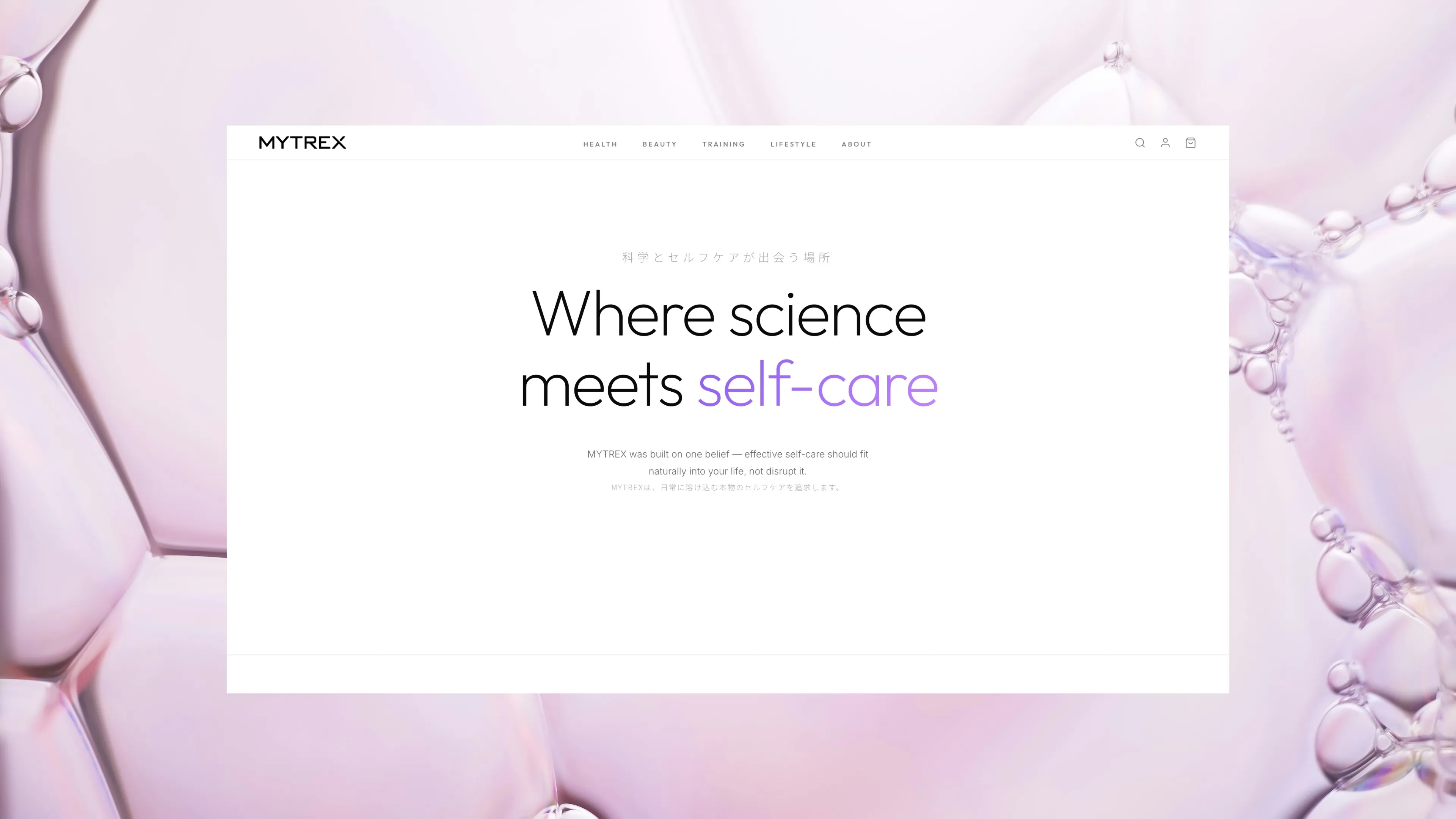
The brief was a single, high-impact concept landing page using purple as the hero brand accent colour — elevating MYTREX from a functional product brand to a premium wellness lifestyle brand with a clean, minimal design system.
Purple accent colour system. Typography pairing for premium Japanese wellness aesthetic. Light/dark section alternation for visual rhythm that communicates both clinical precision and lifestyle aspiration.
Single-page concept layout: Hero with device imagery → brand philosophy → product feature highlights → clinical credibility with athlete endorsements → product line overview → conversion CTA. Desktop and mobile layouts.
High-fidelity Figma mockup. Annotated for developer handoff should the client proceed to production. Brand colour system and typography documentation included.
MYTREX's existing visual identity leaned technical and functional — effective for product specification communication but lacking the aspirational lifestyle appeal that drives premium pricing and brand loyalty in the wellness category. Purple as a hero colour is bold and ownable in this space — but must be executed with restraint so it enhances rather than overwhelms a clean, clinical-meets-lifestyle design system.
A concept landing page built around purple as a confident brand signature — deployed intentionally in key moments (hero gradients, CTA buttons, accent lines, section highlights) against a white and near-black base. Clean typography, generous whitespace, and considered spacing communicate quality without clutter. The layout follows a premium product launch page structure, moving the user from brand aspiration to product confidence to conversion.
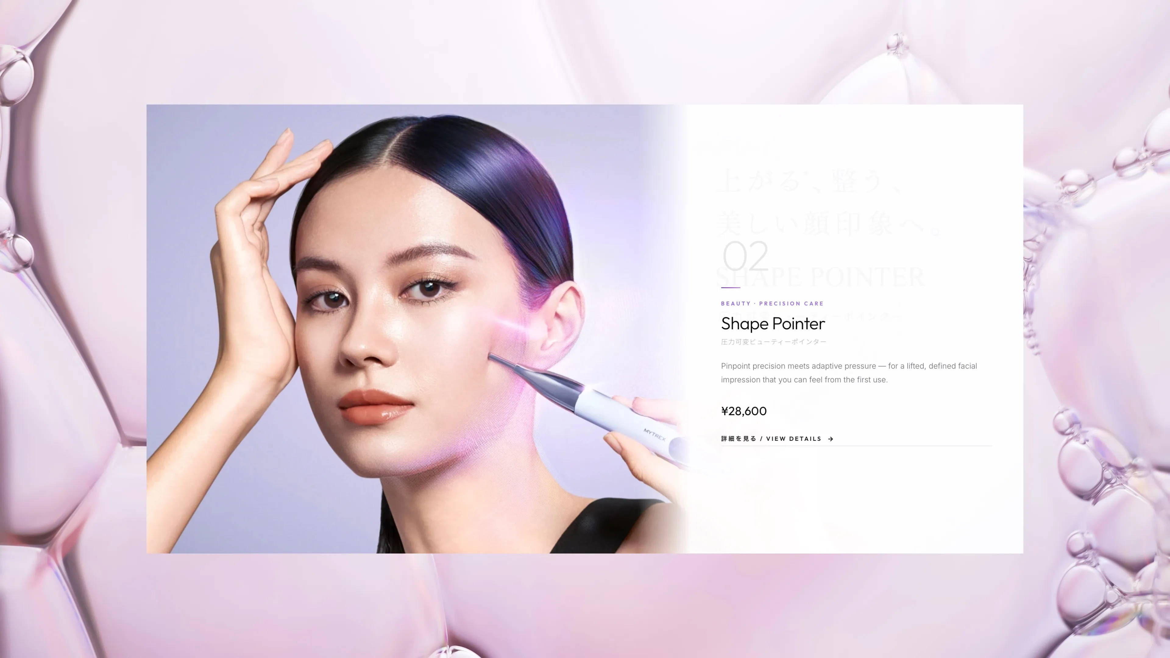 Homepage
 Features
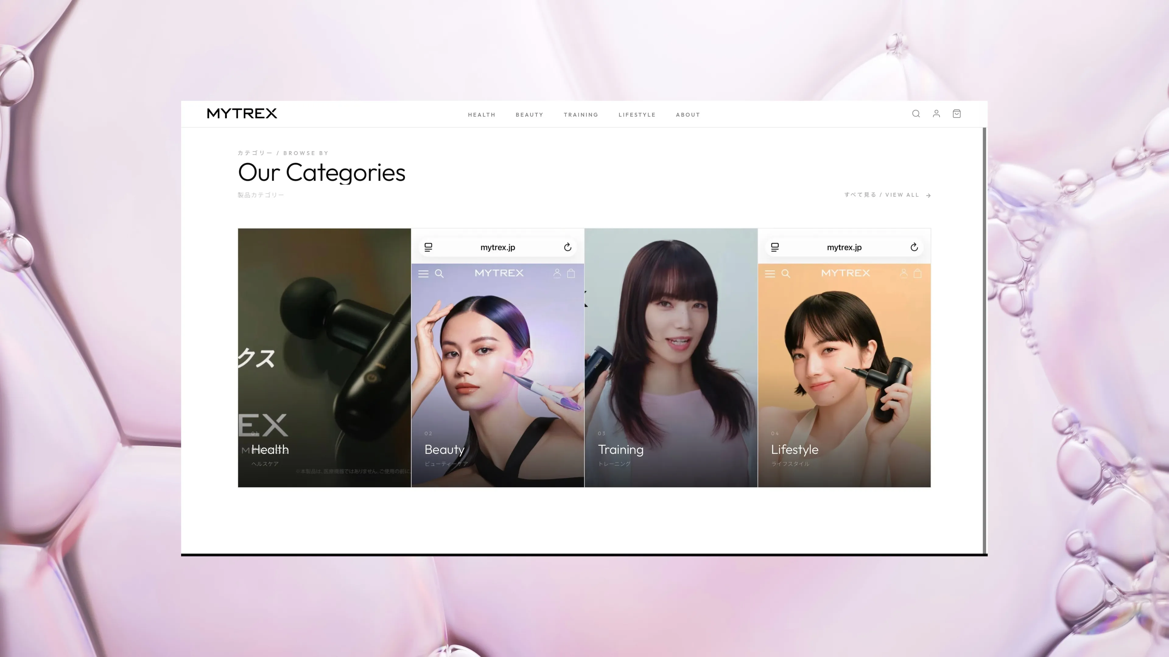 Products
 About
AboutConcept accepted and presented to client at Sotsu Medical Co., Ltd.
Design brief used to launch internal brand refresh discussion